InstUI is the shared design system used across all Instructure products – including Canvas, Mastery Connect, and Parchment – serving ~40 designers and 200+ developers.
Over two years, I co-led a complete ground-up rebuild of InstUI to create a scalable, consistent, and accessible system that supports enterprise-level product complexity while helping teams to move faster.
The team
3 Product Designers
1 Project Manager
3 Software Engineers
My contribution
Research
Token structure creation
Component design/build
Design Ops
Documentation
Please note!
Due to the still ongoing phase of the project I am not allowed to show exact structure or visuals. Every process related detail can be discussed during interviews.
Problem statement
The Challenge
Inconsistent foundations
Colors, spacing, and typography lacked logic or semantic mapping.
Unscalable components
No Auto Layout, Variants, or other Figma features were used to build them.
No usage guidance
Although there was a technical documentation for developers, different teams and their designers interpreted components differently, fragmenting the user experience across products.
Third-party sources
Designers spent extra hours re-creating patterns our system lacked, but others had.
The Goal
From a company perspective, the priority was to create a seamless user experience navigating between Instructure products.
Our mission was to redefine InstUI with clear foundations, scalable token architecture, and a robust, accessible component library, giving product teams the tools and structure to build faster and consistently.
Foundations
The existing system lacked meaningful foundations. Spacing was applied inconsistently, colors weren’t mapped semantically, and many design decisions were ad hoc. To move forward, we first had to define a solid foundation, one that could scale across products and teams.
I led the effort to define and structure our design tokens, starting with an architecture that would support both designers in Figma and developers in code. We worked closely with our engineering team to align on token naming, grouping, and potential implementation logic.
The foundations we established
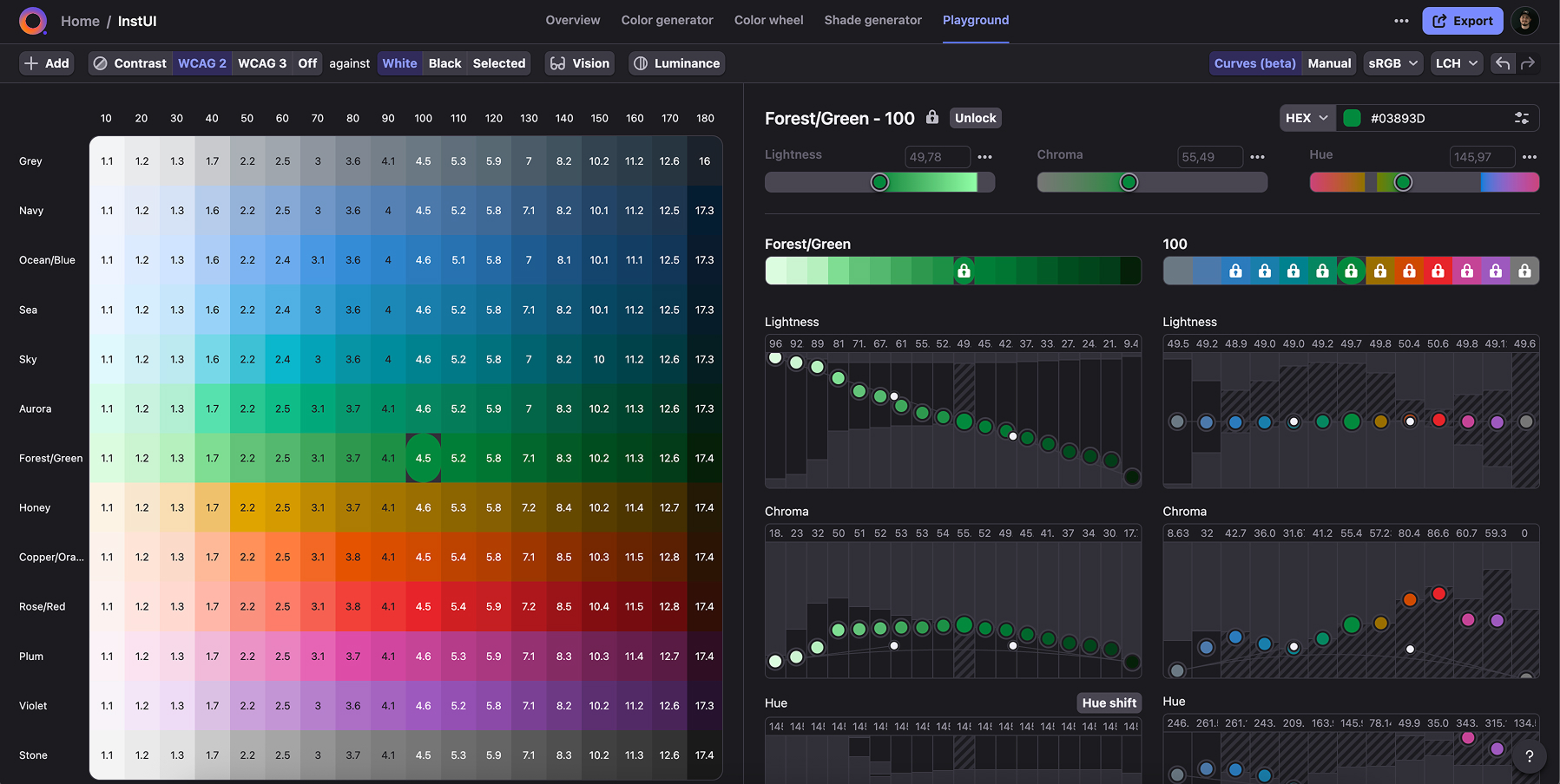
Colors
An 18-step color scale, based on LCH color space to ensure natural perception and accessibility (WCAG 2 AA and AAA). These served as the base for our primitive token system.
Spacing
A scale based on a 4px unit with semantic mapping, eliminating “eyeballed” alignments or custom values, which led to messy and unpredictable layouts.
Typography
Hierarchical scale with semantic styles for headings, body, and links, each mapped to adaptive size, weight and line-height tokens.
Layout
Standardized structural framework for consistent screen composition.
Interaction states
Tokenized rules for default, hover, active, pressed, read-only, and disabled states.
Statuses
Background, icon, and text treatments for success, warning, error, info, and neutral states, to bring uniformity on how statuses are represented across components.
Component design
AI-Driven Exploration
To keep the research unbiased and free from any single product’s influence, I leveraged AI tools like Lovable and Figma Make to rapidly generate a wide variety of component variations. This approach not only accelerated the research process significantly but also helped me spot recurring patterns, validate essential features, and uncover design opportunities in a fraction of the usual time.
Research
After the AI-driven exploration we continued benchmarking patterns from established design systems like Material, Carbon, Tailwind, and Fluent. This helped us ensure that our components offered the right feature set and flexibility for complex, real-world use cases.
Audit
We checked our existing components to identify what needed to be rethought, refined, or rebuilt from scratch.
Feasibility check
Once we had a clear direction, we brought in our engineering and accessibility partners early to validate feasibility and flag any potential blockers. This step was key to avoiding surprises later in the process.
Building
When it came to building in Figma, our goal was to leverage every relevant feature to ensure the components were not just visually aligned, but also scalable and efficient for designers to use. Attention to detail was essential here: padding, alignment, sizing, interaction states, everything was taken into consideration.
Each component was built with
Auto Layout
For structure and responsiveness.
Variants
To consolidate multiple use cases into a single, smart component.
Variables
For dynamic styling and theming.
Nesting
For easier maintenance and to avoid breaking changes with future updates.
Intuitive naming
For quick discoverability.
Design Ops
Governance model
Defined decision-making rules for introducing, updating, and deprecating components.
Contribution workflow
Created a process for teams to submit new components or variants.
Design–code parity checks
Set up regular audits comparing Figma components to code implementations to prevent visual or functional drift.
Library management
Implemented naming conventions, folder structures, and publish/review cycles.
Training
Recorded and provided high-quality training material about component usage and core Figma techniques (Auto Layout, Variants, nesting) to bring all designers to a consistent skill level.
Documentation & Guidelines
Creating components was only half the challenge. Making sure they could be used correctly and consistently across dozens of designers and hundreds of developers required thorough, accessible documentation.
Each component included
All available variants
With explanation on how and when to use each.
Behavioral guidance
Interactions states, accessibility considerations for keyboard users, focus orders.
Responsive considerations
How the component adapts across breakpoints.
Dos and dont's
To avoid ambiguity and ensure visual consistency.
Documentation wasn’t treated as an afterthought. It was part of the design process from the start. By thinking through edge cases and usage scenarios early, we helped our teammates avoid ambiguity.
Results & Impact
While the full system is still being rolled out, the early results have already made a noticeable difference, with measurable impact.
Unified visual language
Established a toolset that can help product teams build consistent look and feel across all Instructure products for the first time.
Company-wide token architecture
Adopted across design and code, reducing inconsistencies and misalignments.
Faster workflows
Minimized custom builds by increasing component use.
Raised design maturity
Provided teams with both components and the context to make better design decisions.
Personal highlights
Led cross-collaboration between design, engineering, and accessibility from day one.
Co-architected a scalable token system that bridged Figma and code.
Future-proofed components with flexibility for evolving product needs.


.svg)
.svg)


.png)